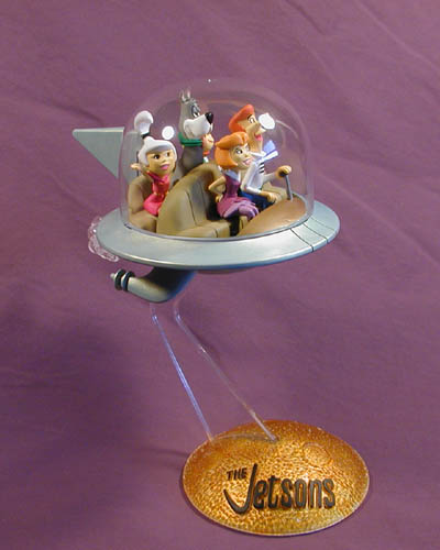
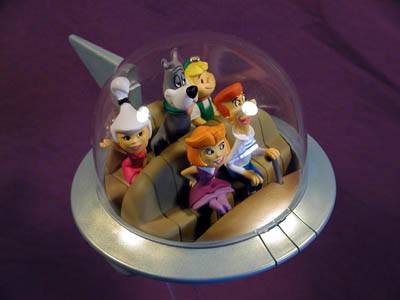
One of Polar Lights newest kits, The Jetsons is a smiple snap together kit that is virtually irresistable to anyone who grew up with the cartoon. Consisting of 17 styrene parts molded in green and clear and five pre-painted vinyl figures, this kit can be assembled in a matter of minutes--or you can take your time gluing and painting for perhaps an evening and have a fun presentation.
I chose to glue and paint mine since I had a new paint I wanted to try.
The first thing I discovered is that the jet extensions and exhaust housing that are supposed to snap into the bottom half of the saucer are such a tight fit that it is almost impossible to do. The exhaust housing is a single piece, so there was no choice but to force it in. The jet extensions, however, consist of two halves each so I fitted the snap-in tabs into the saucer bottom first and then snapped the two pieces together. A little putty blended the pieces smoothly into the hull. Also, the two tailfin pieces were assembled at this time. The saucer itself would have to wait for assembly until after the interior was painted as this piece is trapped by the upper and lower saucer halves.
Colors for the ship really are up to the builder since the ship tended to change color form one episode to another depending on the animator. I chose Desert Tan for the seats with a dark forest green for the floor to tie in with the body color I planned to use. The dash was painted gold--also to tie in with the body. A little silver and black for the control stick and the interior was done.
Now, as for the body, I wanted to try some new artist acrylics archival paints I got from a friend. The color I chose was Oceanic Duotone--a bluish green with goldtone mica in it. From one angle it would be predominantly metallic green and from another the same area would look almost completely gold! This paint does NOT work well over dark colors so I chose a light grey primer as a base. Like all acrylics this paint was transparent so it took several layers before it took on the look I wanted. Topping it off with a few coats of clear gloss helped to visually smooth out the surface since the gold flakes gave the appearance of a rough surface (even though it wasn't).
The base was molded entirely in clear parts. To give it the look I wanted I first sprayed clear orange in the base until I got the desired tone. I backed this up with chrome silver to reflect some light and brighten the orange. The lettering was a raised detail so I had no trouble brushing a flat black on the top of it.
One note about construction and display of this kit. It is top heavy and can easily tip if bumped. To remedy this I cut a circle from sheet styrene to size of the base, packed some plumber's putty (a non-hardening clay) into the dome and glued the circle onto the base. This provided a cheap and easy counterweight as well at a nicely finished base.