A child's imagination, once sparked, can have a lifelong impact on one's interests. Books we read, movies we watch, places we visit all become sources of such inspiration. For me, growing up in the '60s, it was science fiction and science fact that caught my attention. Television, magazines, comics, and the movie theatre kept me enthrawled with the latest in science and fantasy--and how often the two seemed to merge. Men were making their way to the stars, fossils were being unearthed in Africa, technical wonders were being unveiled on an ever increasing pace...and all of this could be seen blended into Saturday afternoon entertainment before the 5 year old eyes of my youth.
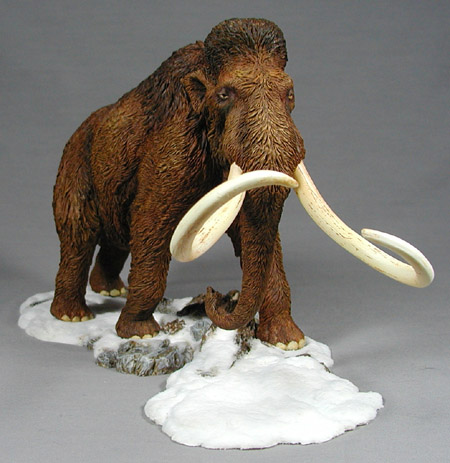
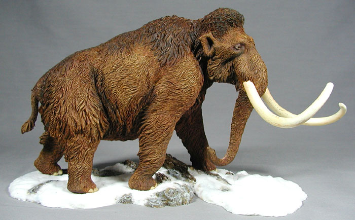
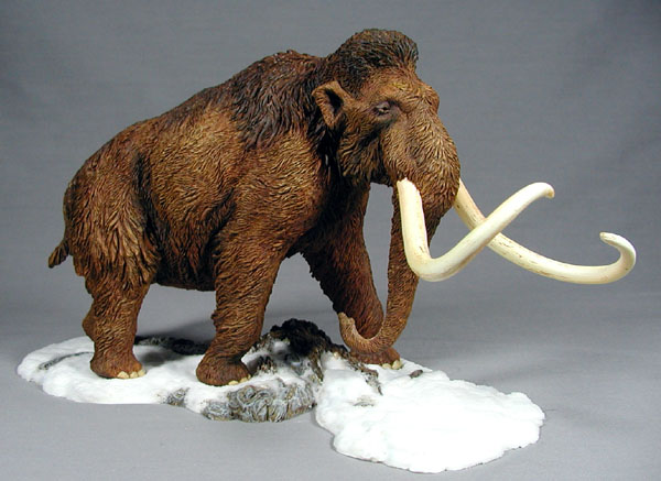
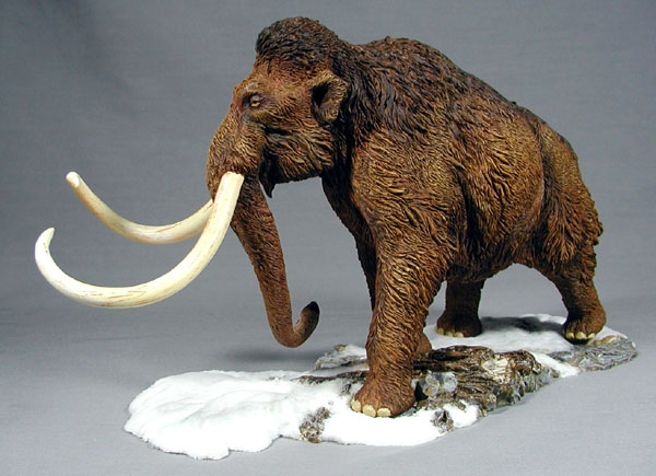
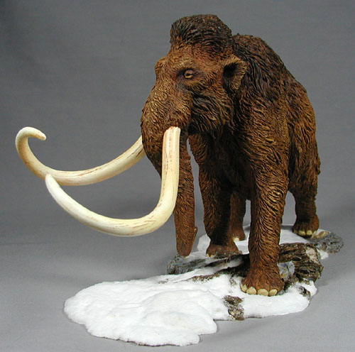
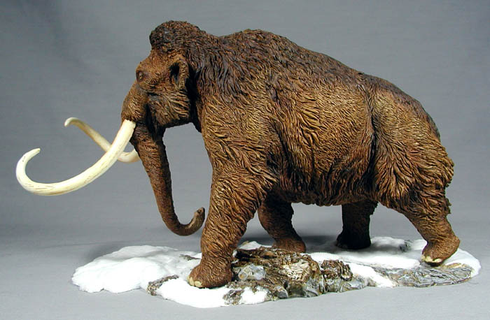
Superheroes abounded, spaceships and robots waged great battles, and dinosaurs and prehistoric creatures roamed everywhere...or so it seemed to a wide eyed child. In the years since then the passion for such subjects still burn brightly inside. History, science, and art still facinate me and permeate my hobby. The latest project to leave my workbench and find it's way onto my display shelves (and this gallery) is the Wooly Mammoth by Alchemy Works. It's a 1/35 scale resin kit consisting of 6 parts: base, tail, trunk, 2 tusks, and the main body. Casting quality was excellent and parts fit was superb except for a slight misalignment between the left rear foot and the footprint on the base.
Construction was simple, though the cleanup was time consuming. With the heavy fur texture throughout the kit and the fact that the body was cast as one piece it took some time to find and remove all the seam lines. Of course the fact that I chose to do most of the cleanup while attending a weekend model show with several hundred patrons in attendance did tend to slow down the work. But then, stopping to show the kit to all the young children and their parents was well worth the extra time. The body, trunk, and tail were cast in an orange resin...what I would describe as creamsicle orange. The tusks and base were in the more traditional white resin.
All the parts were well keyed with stout joints that fit snuggly. No metal pinning seemed necessary since the tail and trunk would be stress-free attachments and the tusks would be kept removeable. A simple bead of epoxy putty was applied around the perimeter of the trunk and tail to fill the small join area left when the parts were pressed together. Five minute epoxy was used for the gluing medium. Once the parts were attached and the putty had a little time to start setting up, I shaped the excess to match the fur texture leaving a seamless assembly.
Both to cover the orange resin and to give a neutral base, I chose to use a grey primer over the body and the base. I felt this would be better than the white primer used for most flesh tones. The tusks were left unprimed.
Color, what to do about color? I debated this for a while since I've never seen one of these beasts in person (who has?). I could have gone with shades of grey but felt it would be a bit boring against a white snowscape. Brown seemed a bit obvious, but it was intended to be a naturalistic representation, so brown it would be. I knew immediately that I'd hear references to Manny the mammoth from Ice Age. I even joked about putting a tiny Scrat somewhere on the base. In the end, of course, I went with the safe path--no Scrat.
I started with a base coat of yellow oxide followed by a heavy wash of raw umber to tone down the yellow and darken the recesses. At first I expected to use a lot of transparent paints to shade the fur much as I use on the stegosaurus a while back. The more I looked at the thing and studied what I wanted to do next the more I thought about drybrushing in more shades to the fur before the transparents. Eventually, I bagged the idea of transparents entirely and went exclusively with drybrushing. Over the base yellow oxide I started with burnt umber, expecting to blend and accentuate the umber wash. The effect was more subtle than I expected even when applying a heavy hand. I followed up the umber with burnt sienna, then with raw sienna, and finally back to the yellow oxide; applying it softer and more selectively with each color.
Next was the shadowing and the darker mane. At first I went back to the raw umber but soon found it wasn't nearly dark enough while drybrushing. I mixed up a roughly 60/40 blend of raw umber and mars black to achieve the tone used for the mane and the shadowing around the legs, eyes, ears, and other shaded areas. A little more yellow oxide to punch up the hightlights finished the fur.
The toe nails were based in parchment, a sort of greyish ivory color. Soft washes and drybrushing of raw sienna and yellow oxide completed the tone. To be honest, the color selection here was a bit arbitrary since referencing real elephants tended to reveal various shades of their hide color as well some variations of a muted ivory tone. The best I could do was use a bit of artistic license and relate them to the tusks. The eyes, too, used some license. To paint them a nearly solid dark brown like real elephants would seem dark and unfinished. Thus back to the ivory yellow tone for the eyes with pupils of black. Is this realistic, probably not...but I felt it looked better.
The tusks were a bit of trial and error. What could be so difficult about ivory tusks? Well, it was more a matter of failed experiments than anything else. I had thought to leave the tusks the bare resin color since it was a creamy white. The would have been too plain so onto some sort of shading. First I thought to try wood stains to tint the resin and darken the axial striations. No good--the stain would just bead on the surface with no penetration into the resin. Round two...rub some oil paints into the grooves and then tint the tusks with transparent paints. The deadline to get the kit done was too close to put up with the drying time of oils. Doh! Ok, round three...an acrylic umber glaze to shade the striations and then the transparents to shade. Not bad, but the glazing was not dark enough and the shading was too strong. One more try...stronger glazing and softer shading. That would have to do with the deadline fast approaching for the annual Wonderfest trip...and I still had the base to do.
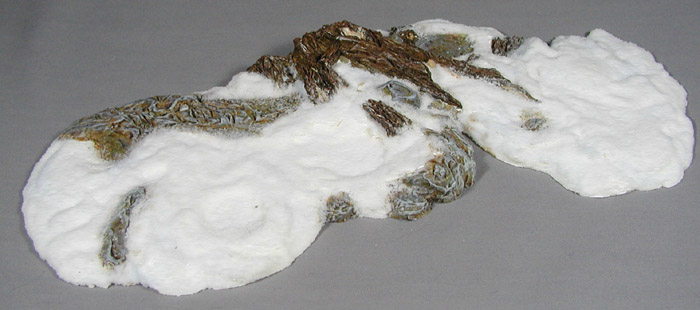
It took some careful studying and some educated guessing to determine what was what on the base. Cast if white resin, it was difficult to determine what was intended to be snow, rock, or wood. I truth only the larger tree trunk sections could be positively identified. The rest was a judgement call as to what texture was better called stone or snow and where would the color of exposed rock look good. I freely admit that I'm not overly happy with the final results...but then, I always feel a bit lost when it comes to painting stone and bases in general.
Once the various textures were deciphered and the piece was primed in grey I started blocking out the areas. Umbers were used to block out the wood with drybrushing of siennas to start the highlights. Tan was used to base the heartwood with light grey used to drybrush in highlights and give the wood some of the silvering effect you see when wood has been exposed to the climate for an extended period. The rock areas were first sponged with some yellowish browns and yellowish greens to imply some soil and lichen. A medium grey was then brushed haphazardly over this to bring out the exposed rock with lighter grey for highlights. A final grey liberally lightened with white was softly drybrushed over both rock and wood to hint at a bit of frost.
Lastly, the snow had to be created. I had always intended to use a ground cover for this since I wanted some texture and maybe some irridescence. After looking into a few different techniques I settled on the Woodland Scenics snow flake ground cover as the simplest and most effective look. Using the scenic glue also available from Woodland Scenics, I sprinkled the snow over the area I was working at that moment and then applied the glue using an eye dropper. Since I didn't want the snow covering the rock and wood, I felt this was a more controlled approach than using the spray bottle method mentioned on the container. Working back and forth on the surface, it was a matter of a few hours and the snow covered the entire base. I let it frost onto the edges of the rock and cover portions of the wood for a more natural transition. I had intended to shade the valleys in the snow with a light blue tinting but the attempts were too garish and the idea was scrapped.
Well, there you have it. The end result isn't as good as the pros would achieve but I'm pretty happy. I know that if I go back over it I'll find more things that can be improved...but then, we're all our own worst critics, aren't we.