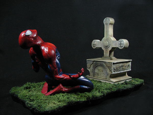
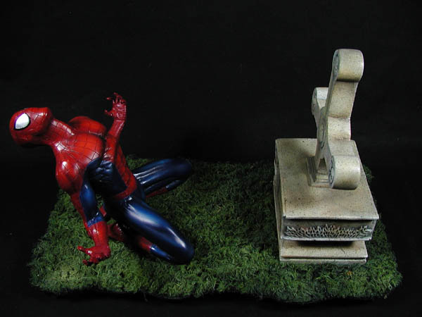
“The Other”—one of the pivotal multi-part stories in the Spider-Man saga. The kit, sculpted by Tommy Allison and produced by Killing Time Kits, is a three dimensional representation of the dramatic cover from The Amazing Spider-Man #525. Rather than the dramatic red and black of the magazine cover, I chose to use more traditional colors and work on my shading and highlight skills during this exercise.
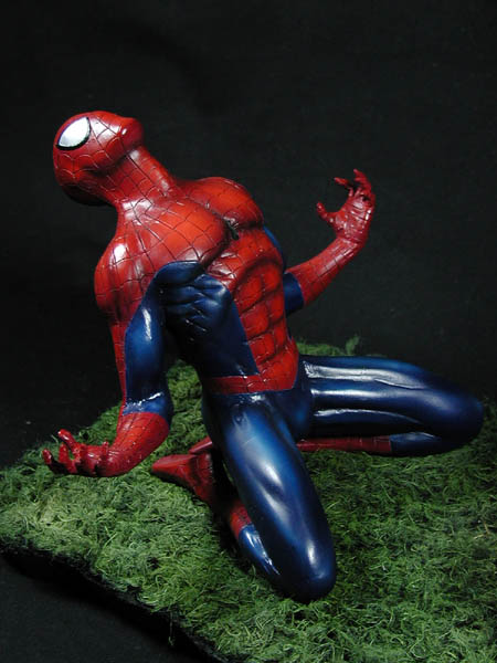
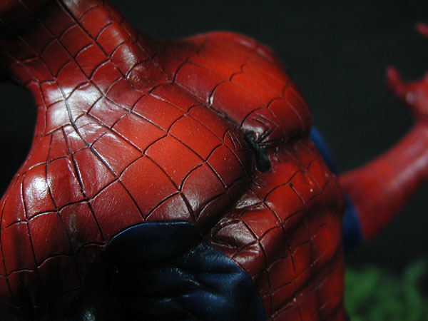
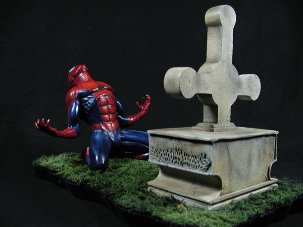
The project broke down into three facets: Spidey, the tombstone, and the groundcover. The drama of the piece was clearly centered in the figure. Strong colors, shading, and highlights were demanded. I chose Deep Brilliant Red and Prussian Blue for the base colors of the costume. For the highlights, yellow was added to create more of a crimson tone and then focused on the high points as though the light were coming over the right shoulder. The highlights on the blue were built up in layers of blue progressively lightened with white—again, keeping in mind the direction of the implied light source. Shadows and shading were then added using ComArt Transparent Smoke for a dramatic contrast with the highlights. Finally, the webbing was handled by washing the lines with thinned Mars Black oil paint. The various finishes were evened out and sealed with a couple layers of a satin clearcoat mixed from two parts lacquer dullcoat to one part lacquer glosscoat.
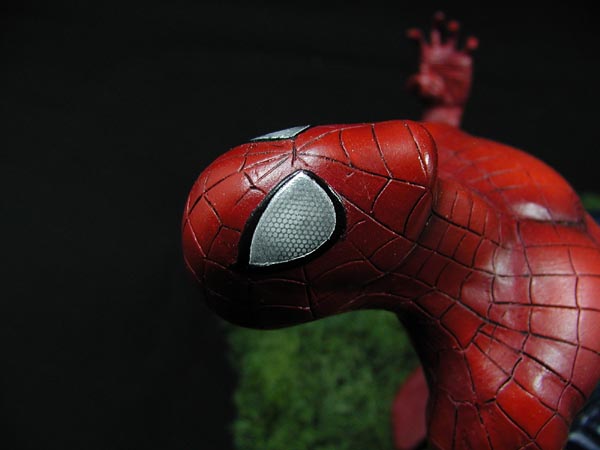
The eyes were a final detail that I had debated for some time before deciding to go ahead. First the entire eye and trim were painted gloss black. When cured, the trim was masked and the inner eye was painted with Alclad chrome (though any chrome silver would work). Finally, leaving the masking in place, I held an old shaver screen over the eye and misted white through the screen with an emphasis on the center of each eye. This left the insect-like honeycomb pattern.
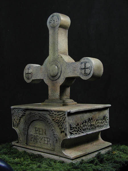
Painting the tombstone was another learning experience. I don't have much experience with dioramas and thus not much practice painting stone or concrete surfaces. Not really knowing how best to approach this i went with gut instinct. First I basecoated the entire thing in Parchment (an off-white/grey color). I then coated it with a thick wash--almost a glaze--first with black and then later with a dark brown. Next came a loose spray of ComArt transparent Moss Green, Burnt Orange, and Sienna Brown to create some of the staining effect. Now a took an old toothbrush and spattered a dark grey over the surface for a speckled effect. Lastly, I went over the surface with several earth tone pastels. Overall, it's not a bad effect but hardly as good as a professional might achieve.
The last technique for me to explore on this project was creating the groundcover. The original plan was to partially cover the tombstone in dead leaves, vines and other overgrowth surrounded by overgrown grass--as though the grave had been long neglected and forgotten. Obviously, this part of the project was not completed though the overgrowth may still be added in the near future. The grass technique came from a seminar at Wonderfest '06 by Mike Wallace. In short, the grass is created using fake fur found at the local fabric store (I chose to use black fur for a dark base color), soaked in liquid starch and combed out as it dried to create the scale grass. This is then sprayed with various shades of green ranging from deep green to almost yellow green. Tans and browns could be used if dead patches or dry grass is preferred.